Saturday, April 14, 2012

A Journey into Camelot Village

Camelot Village-affordable country living…yet you can’t find your way.

I always thought this sign was so esoteric. Under the reflection of this project I am convinced it is. This development boasts “country living”, right off a main highway. Really? I think they use the word “affordable” first, before country living, to attract attention. It is also ironic because just to the left of the frame you can see the side of the sign for Hillcrest Commercial Park. That doesn’t seem to signify country living-right next to a commercial park. Irony again. (The commercial park is really storage units that reside on the right of the driveway into Camelot village development). In terms of sign design, green on white is one of the high visibility color recommendations (esigns). The sign is lit up at night and very clear. The landscaping around the sign is attractive and does draw the eye to it.

Signs

For people looking to move into Camelot Village, their first stop is the sales office. The sales office is on the left, but it looks like any other house in the development. The sales office sign points straight down the road. In front of the office, there are no signs indicating it is the office. The next building that is visible is this:
Which again is not signed and is actually the mail boxes for the residents. If you drive past this building all that remains are homes. It becomes clear after driving for a while that the other possibility for the sales office is the house in the front of the development. “People need information to make and execute decisions” (Passini, P. 89). This is the basic principle of wayfinding. The first experience in the development results in frustration and difficulty making sense of where things are.
Maps
The directory map makes one thing clear; this is going to be a confusing journey. As you can see the colors indicate multiple streets. The red indicates seven different streets. “Color is an effective way to convey differentiation” (Baer, p. 90). In this case, the color only differentiates sections of the village instead of signifying different streets. Well, hopefully the streets and appropriately marked.
Street confusion

As you drive down the first street in the villiage, you come upon this intersection, that is the main street merging to the left and right, while it continues on straight ahead, except on a slant. The sign to the left is the only street sign and is obscured by the branches. If you chose to go right, you come upon a sign that is all the way past the intersection.
To the slight left of the street sign is the continuation of the main street that is not a straight line, but a curved road around a home. This picture shows the view from the other direction.
The confusion within the development continues all the way through, with missing signs, unclear directions, few marked houses, and streets that seemingly end before a marked start of the next one.
The street ends where?

Most street intersections look like this. There is one sign marking the cross street (the street to the left) while the street you are on is not identified. The road curves off to the right and starts a new road. There is no sign at the end to signify the street changed and the houses just before the road curves are actually assigned the new streets address.
Audience
This development is poorly signed and the maps are difficult at best. The audience for these directions cannot be prospective tenants. Even people who move in take a few months to fully understand where streets start and stop. Some of the older tenants never quite figure out which street merges into another one.
Design and Structure


The design of the development, the placement of homes and streets, actually is laid out very well. The structure makes sense and logically, seems to make navigational sense. The homes all are set on the property in a logical way considering the homes around it. The streets in the back, on the borders of the development, have a wooded area and storage units. The storage units are not obtrusive and are hidden on the edges of the property. The mail unit and sales office are in logical places and easy to get to. The basket ball court is centrally located and on a main street. The navigational difficulty is the signage and street directory. The village developers paid little attention to the users of the village and failed to conduct usability tests. The signs and map certainly fail to meet user-centered design standards.

References
Baer, Kim. Information Design Workbook. Beverly, MA: Rockport Publishers, 2008. Print.
Passini, Romedi. ”Sign-Posting Information Design” Information Design. Ed. Robert Jacobson. London: MIT, 2000. 83-98. Print.

Monday, April 2, 2012

Information Design Tools: From Visuals to Speech

Meaning is a community of understanding. The transfer of meaning is the basic purpose of language, and the association between language and meaning is indissoluble. Mario Pei

Visuals are only half of the Story
(Please note: Some images are graphic)
We have discussed the plethora of information that is available which has defined the age we are in as the information age, also called the digital or computer age. Both information storage and information transmission capabilities continually improve as devices get faster, smaller, more efficient, and perhaps “smarter”. Now, we have intelligent assistants in our phone.
Enter Siri

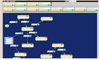
Siri can find contacts; recognize relationships, set events, modify calendars, set alarms, find the weather, tell you the date, set a timer, send an email, reply to texts, locate businesses, give directions, play messages, write notes, complete web searches, answer questions, and provide reminders. Siri completes these tasks with verbal commands and delivers both a spoken reply and visual reply.
How it Works

Sound Conveys Meaning
“The need for effective information design spans every medium” (Baer, p. 122). Meaning transfer is critical within information design and depends upon communication. Communication devices have changed over time and “each increase in the complexity of our communications vehicles-the moves from pictorial languages to abstract alphabets or from cave painting to digital image manipulation-has been motivated by a desire to improve the range and richness of meaning we can share” (Macy, Anderson, and Krygier, p. 296). Technology has provided recordable greeting cards, talking envelopes, and postcards with spoken marketing messages.
In my blog
I used sound and visuals through the video called “Designing Sound”. The video, on its own, can convey the effect sound has on visuals and the importance to information design in order to convey effective meanings.
Works Cited
Baer, Kim. Information Design Workbook. Beverly, MA: Rockport Publishers, 2008. Print.
Macy, Sheryl, Anderson, Elizabeth, & Krygier, John. ”Interactivity and meaning.” Information Design. Ed. Robert Jacobson. London: MIT, 2000. 293-299. Print.

Thursday, March 15, 2012

Visual Mapping: Turning complex text into a simple visual


    "Hey Jude" Visual Map


Visual Mapping and Information Design

First Steps


Early communication starts with drawing as children develop their vocabulary. Their comprehension of words and phrases is evident even though they cannot verbalize responses. They use “sounds, gestures, and images…[and] they draw rounded shapes, scribbles, zigzags, and other nonverbal expressions to express thoughts” (Hansen, p. 197). This process we learn as infants and continue to cultivate is visual thinking.

The Process


Visually represented ideas provide a way to organize, develop, refine, and retain information. “Graphics have the capacity to transform our understanding” (Hansen, p. 203) Graphics allow us to see information and visualize a scenario that can lead to the purchase of a product or provide a clear solution that was not evident through text representations. Dan Roam indicates that drawing a problem at a minimum presents us “with an infinitely clearer view of our situation” (p. 256). Information Designers rely on graphical representations of information to use as communication that conveys meaning and understanding. Technology and the information explosion have made graphics available and prominent through their integration on the internet and social media platforms.

Visuals in Advertising

The power of simplicity in design is evident throughout advertising campaigns. The ads we recall are short, simply, yet catchy. Another simple design is Icons which are representations of social media platforms or programs. When we see an icon we think of the program capability and uses or the social media platform that it represents.

Software Visuals
                              When talking about Tableau Software, a data visualization program, CFO Magazine is quoted as saying, ”In terms of generating useful, multidimensional visual analysis, it's like going from an Etch-a-Sketch to Industrial Light and Magic. Quite simply, it's the best piece of software CFO has run across in years” (Shien). There are many mapping software programs that can help put words into pictures. What they all have in common is the simplicity of the visual that they create to explain and present information that otherwise, without a visual, would just be words that are just half of the message.
My Blog Map and Implementation

In my blog, I have used the right side bar as supporting text with graphics that correlate to each post. I tend to reply on words more than graphics. In this blog I incorporated a visual graphic for each section of the post. The graphic represents the main idea I was expressing and the text supports it. I tried to make the graphics explain the post instead of the words. I also used a video that gives a great example of visually mapping a popular song.
Works Cited
Hansen, Yvonne M.”Visualization for Thinking, Planning, and Problem Solving.” Information Design. Ed. Robert Jacobson. London: MIT, 2000. 193-220. Print.
Roam, Dan. The Back of the Napkin. London: Penguin Group, 2009. Print.
Shien, Esther. “What's Hot This Summer.” CFO Magazine. August 1, 2007. Web. March 13, 2012. http://www.cfo.com/article.cfm/9539622/c_9572331?f=magazine_alsoinside

Saturday, February 25, 2012

Module Three: The Process of Information Design

Any process goes from start to finish. The trick is defining what the actual start is and what the finish is. For example, the process of Christmas shopping can start and end with different activities. Some people start with making a list and end with watching gifts being opened. Others may start with the actual purchasing of gifts and end their process with wrapping the presents. Neither process is right or wrong and both processes have strengths and weaknesses.
Information design requires process planning that views projects from the very first step to the final outcome. This requires careful planning, critical thinking, systems thinking, brainstorming, and effective communication
Steps of an Information Design Process
1. Who? What? Where? When? How?
The first step is to ascertain the scope and strategy for the project. These questions will help define the project parameters that identify the range, the audience, the use, and the content for the information. The data gathered facilitates the action plan for the project.
2. Creative Brief-(two to ten pages)
The next step is to organize and arrange the gathered data to facilitate the design phase. The creative brief outlines the important project information to convey the “project background and goals” (Baer, p. 50).
       
3. Persona and Scenario
Information needs to be designed so that users can read, understand, and process the presented material. A persona mocks the intended user group and provides reactions, observations, and rebuttals based on users habits, needs, propensity, and proficiency. The mock users can execute different ways of using and interpreting the information to provide feedback that allows the design to be refined based on the feedback.
4. Prototype, Research and Testing
Prototype
The final product is tested using a prototype presentation that allows users to test the product and ensure it accomplishes its objective. Two examples of prototypes are a sitemap and blueprint.
              Sitemap
A sitemap is a tool that presents structure, flow, and nomenclature which provides a visual image of the entire project including all sections and levels. Sitemaps are helpful for web designs, menu sequences, and interactive media. A project map allows for revision history to be tracked, approved, and finalized. As a result, the client can become acclimated to the basic flow of a design before implementation. The sitemap also communicates the details and meaning of the essential project components.

http://www.utexas.edu/learn/designprocess/graphics/sitemap.jpg
              Blueprint
A blueprint provides the details to the sitemap that allows for a view of project organization. It encompasses the project parameters and allows for workability assessments. The blueprint is somewhat rudimentary and simplistic in that it will not encompass the finite details of color, final text, or other graphic elements that the final polished design will have. Blueprints, often called wireframes, provide user reactions that begin the testing process. While blueprints are often linked to plans for buildings they can also be used for blog designs.

http://page49.wordpress.com/2010/04/16/information-architecture-%E2%80%93-design-and-documentation/
Research and Testing
User feedback is essential to the design process and the previous steps provided isolated, but important, feedback. The next phase is to select representative users to ensure each step is tested outside the internal group of designers and the client. Testing should be done in phases to minimize extensive changes. The testing prototypes “need to look enough like the final so it’s clear to users” what they are (Baer, p. 82). Alternately, prototypes for testing should not be so close to final that they are mistaken for the final and then become preferred. Testing is conducted using the client’s customers or through outside agencies that find appropriate users. Different types of testing apply to different projects and in some instances surveys, live testing, group tests, or individual test are more applicable.
   Testing types
Concept Tests-early test that discusses the design with potential users
Participatory Design-sorting through ideas by interacting one-on-one with participants or with the card sorting exercise.
Design Testing-a process to get specific feedback on functionality or appearance based on different scenario usage.
Focus Groups-evaluation of a developed product by a group of people. It is more productive when groups are used for a quick consensus and participants are not strangers.
Usability Testing-ensures functionality is working as the designer envisioned and that average users have the same user experience as the designer.
Beta and Performance Testing-tests the design in the contexts of practical use. Simulates how users will interact and tests possible scenarios.
Important Steps
The most important step in any process is the beginning conversations that set the stage for the project. “Many factors that determine the success of a design piece are unrelated to the formal aspects of design but have everything to do with the context in which the design is created” (Bear, p. 32). Understanding the client and their organization is critically important to the final outcome of the project. I think this process goes further than the first questioning step of the information design process. Understanding the complexities of the organization is necessary to develop the framework and context of the project. Recognizing the organizations history, inner-workings, challenges, constraints, previous experiences, and authority positions establishes the initial baseline for the project. This information is needed before the audience and content can be developed.
Other Steps to Consider
In addition to gathering preliminary client information, it is important to develop project milestones and success metrics.
              Milestones
Milestones define a tangible step in the process that is met before the next step can begin. This also provides a concrete way to measure project completion steps. A sample of a milestone chart used within my organization is below.


              Success Metrics
The success metrics should demonstrate the attainment of defined goals and targets. In an organization, these should ultimately support the strategic plan. Success metrics might be a final grade, number of comments, sales figures, or website downloads.

Saturday, February 4, 2012

Module Two: Information Design Theory

Sense-Making: An Information Design Theory
Definition
"Sense-making is the process of creating situational awareness and understanding in situations of high complexity or uncertainty in order to make decisions" (Goldenmap, p. 4).
Sense-Making Applied
As I read the theories of Information Design, it became clear to me, that I have used sense-making. My first blog post uses an illustration of two pictures and asks the question “which picture?” As I explored the theory of sense-making, I recalled this question from my blog post, but in my mind thought the question I posted was, “which picture makes sense?” This process illustrates part of the sense-making theory. I processed interpretations of the theory, correlated them back to my blog post information design experiences, recalled the question I asked to illustrate effective use of information, and then made and unmade my own sense of the methodology I employed.
What is Sense-Making?
TIME   SPACE   MOVEMENT   GAP
Sense-making is a theory and methodology focusing on metadesign which provides the framework for making use of information to make sense. “Information is made and unmade in communication-intrapersonal, interpersonal, social, organizational, national, and global” (Jacbson, p. 41). Effective information design must address the varying ways information is processed, assimilated, constructed, and processed through time and space relationships. Sense-making relates to the concepts of time, space, movement, and gap which are the “in-between spaces between order and chaos, structure and individual, culture and person, self 1 and self 2, and so on” (Jacobson, p. 45).
Pro
·      Sense-making is a collaborative process that capitalizes on a multitude of perspectives facilitating group thinking and broad awareness’s.
·       Sense-making embraces chaos and removes it as a threat to information design. The focus is on order and chaos as a collective design tool that facilitates definition of both aspects. This view brings prominence to information design providing a gateway to new and innovative avenues for individual and collective approaches to information design assimilation.
Con
·       Continued sense-making can “stifle innovation and change as it creates a strong sense of identity within organizations and groups” (Herbert, p. 8). Sense-making allows for information sharing; as information is interpreted, becoming less chaotic and clearer, people form new contexts and associations which ingrains the new sense they derived and ties it to back to defined affiliations. This process closes off new assimilation's to change and forces integration of logic and sense to conform to old patterns.
·       Sense-making focuses on group actions and is less concerned with individual assimilation's. Individual thoughts and logic tests are less important than group collaborations framing sense-making as an individual starting point to facilitate more complex methodologies.

Applications
The seven properties of sense-making can be used to create effective communication to facilitate information assimilation.
1. Identity-the who, what, and how
2. Retrospection-what is noticed and interrupts attention
3. Enacting-understanding and organizing experiences
4. Social-narratives retained and shared
5. Ongoing-observation and reaction
6. Cue Extraction-decisions of relevancy
7. Plausibility-reality versus accuracy
Interpretation of blog information requires the seven properties (above) as people interpret and attempt to make sense of communicated information. Users of information need to assimilate the communicated message to arrive at a clear understanding to facilitate sense-making of the blog content. Blogs that analyze these seven properties, to ensure each component is fully developed, facilitate the information user and effectively fulfill an information design message.

References
Golden Map. Sensemaking. http://en.goldenmap.com/sensemaking#

Herbert, Karen S. Sensemaking. (2008). EDP 382L Cognition and Behavior: The University of Texas at Austin. Web. Feb. 1 2012. > http://www.edb.utexas.edu/robinson/Sensemaking%20Chapter_files/
Sensemaking%20Chapter.htm<

Jacobson, Robert. Information Design. Cambridge, MA: MIT, 2000.

Saturday, January 14, 2012


Module One: What is Information Design?

Communication   Designing Information   Solving Problems   Selling Ideas


Logos   Icons   Apps   Branding    Graphics   Shortcuts   Pictures  


The Industrial Revolution paved the way for the Information Age and technology provided the tools for an information explosion. Logos and corporate branding became desktop shortcuts, leading to icons, and then apps. A once intricate corporate branding strategy, with complex designs, has evolved into a small icon used as phone apps, internet advertising, or tag lines on email messages. Technology bridged the generation gap and provided communication methods tied to gadgets designed to peak everyone’s interests, with no age limitations. Technology is a critical component of communication; Information is everywhere and interfaces are plentiful. Nanotechnology provides finite chip designs that facilitate new and improved devices which are smaller than previous models. The Internet provides countless information sources to sync devices. Streamlined communication, using a vast array of sources and data streams, is necessary for organizations to remain competitive. “Companies in every sector understand the need for using information design practices to differentiate themselves and gain strategic advantage” (Baer, p. 20).

Information design is essentially the presentation of data in a way that coveys useful and meaningful information. There are a plethora of sources that define the term and different professions that work within the discipline. In the Information Design Workbook, Baer refers to a definition of Information design from the Society for Technical Communication’s (STC) special interest group as being “the translating [of] complex, unorganized, or unstructured data into valuable, meaningful information” (Baer, p. 12). In his article, Information Design: The Understanding Discipline, Dirk Knemeyer defines it this way, “Information design is the integrator that brings other disciplines together to create excellent information solutions.” Despite any confusion or debate concerning definitions and meaning, it is clear that Information Design is about efficient communication.

The disciplines that have come together within the field of information design are Graphic Design, Information Architect, Interaction Design, User Experience Design, Usability Specialties, Human Factors Specialties, Human Computer Interaction Specialties, and Plan Language Specialties (Baer, pgs. 14-15). These specific practices all work with information in an effort to convey a message. Research, user experience, interactions with peripheral devices, products, services and environments, along with visual communication, organization, and interactions with information all encompass aspects of information design.
References
Baer, Kim. Information Design Workbook. Beverly, MA: Rockport Publishers, 2008. Print.
Knemeyer, Dirk. “Information Design: The Understanding Discipline” (2003). Boxes and Arrows. Web. 14 Jan. 2011. <http://www.boxesandarrows.com/view/ information_design_the_understanding_discipline>.
Redish, Janice C. (Ginny). “What is Information Design?” TechnicalCommunication. June 2000, 163-166. Web. 14 Jan. 2011. <http://dwheelersite.com/PDFs/Articles%20for%20Reading%20List/Redish%20What%20Is%20Information%20Design.pdf>.